From Paylo to Ontime.
Goodbye Paylo
Every cloud has a silver lining. It was early this year when a friend flagged a business called Paylow, a startup in the subscription management space. Paylow had registered a trademark and so we knew we’d need to change our name.
Although we loved the way Paylo sounds and the fact that it has a pleasing element of ‘does what it says on the tin’, some had noted that it came across a bit cheap and might not sit well against some of our client brands. We sensed that we could do better.
Hello Ontime
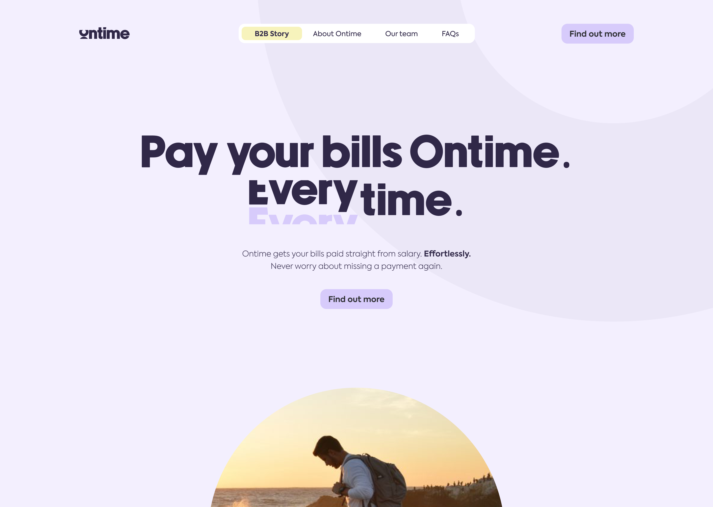
Ontime. That’s what we’re all about. Helping customers to make their payments on time, every time. And with that reliability comes a whole load of benefits like cheaper prices, healthier credit scores and a weight off the mind.
Broadband that doesn’t drop, a boiler that fires up every day, a train that arrives on time—a little bit of dependability goes a long way.
With Ontime, our promise to our customers and clients is clear. It’s centre stage. The tone of our brand name is important. We’re building the way people will pay their bills for the next hundred years.
So that’s why we’re Ontime—reliable, transparent, maybe even a bit boring? And we’re all for boring. Because more boring financial lives means more time for our customers to have fun in their real lives. To be present. To connect. To reflect.
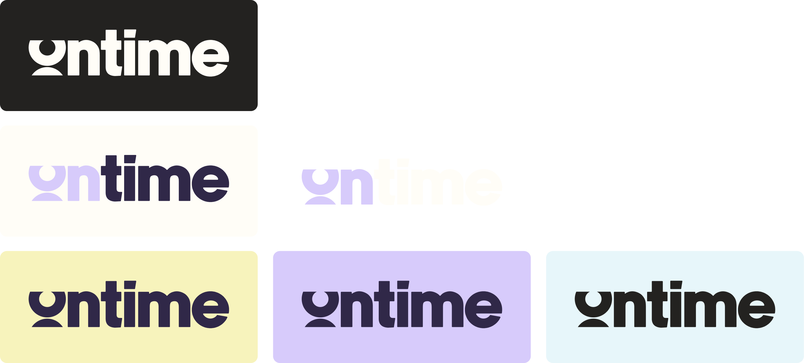
That’s why we look the way we do. Our blend of deep purple and lilac as well as the rounded edges of our typeface and logo mirror the calmness which we’ve designed our product to inspire. The design of our logo nods to the train-station ticker board and the metronomic rhythm of the flip clock.
The photography we use is human. We use aspirational, golden-hour shots of people living in the moment, connected to each other, the world and their inner selves. Because that’s what we want our customers to feel once they’re relieved from the stress of bills.